
Zooniverse app refresh
As an effort to reach a new audience, Zooniverse created an iOS and Android app in 2015. I recently had the opportunity to breathe new life into the app's UX and visual design, streamlining the user flow and updating the visual style to more closely mirror the current desktop app.
These images are speculative; as a small, grant-funded team, developer time is at a premium.
Find the current version in the app stores by searching "Zooniverse."


Project Category
Mobile Design
—
Role
Product Design
Home
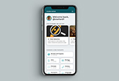
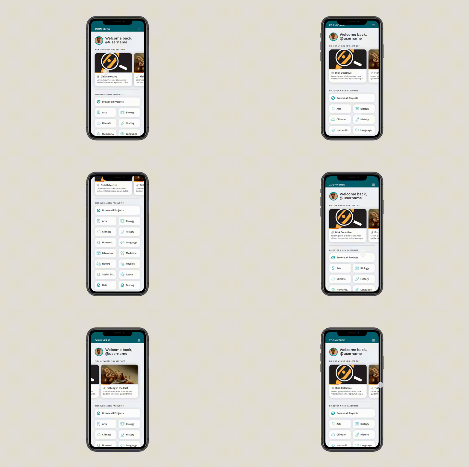
Upon returning to the app, users see a greeting and can find shortcuts to quickly return to the projects they had been working on.

Classify
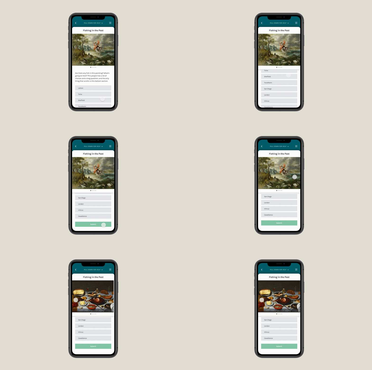
The main action of the app: Zooniverse volunteers can make classifications on projects that enable a mobile workflow. On zooniverse.org or here on the app, anyone can contribute to real research by answering a few questions about images from massive datasets. Topics range from astronomy to ecology to cancer research, and each project is designed to be rewarding for Zooniverse's wide range of users, from ages 5 to 95 and from all over the world.

Help
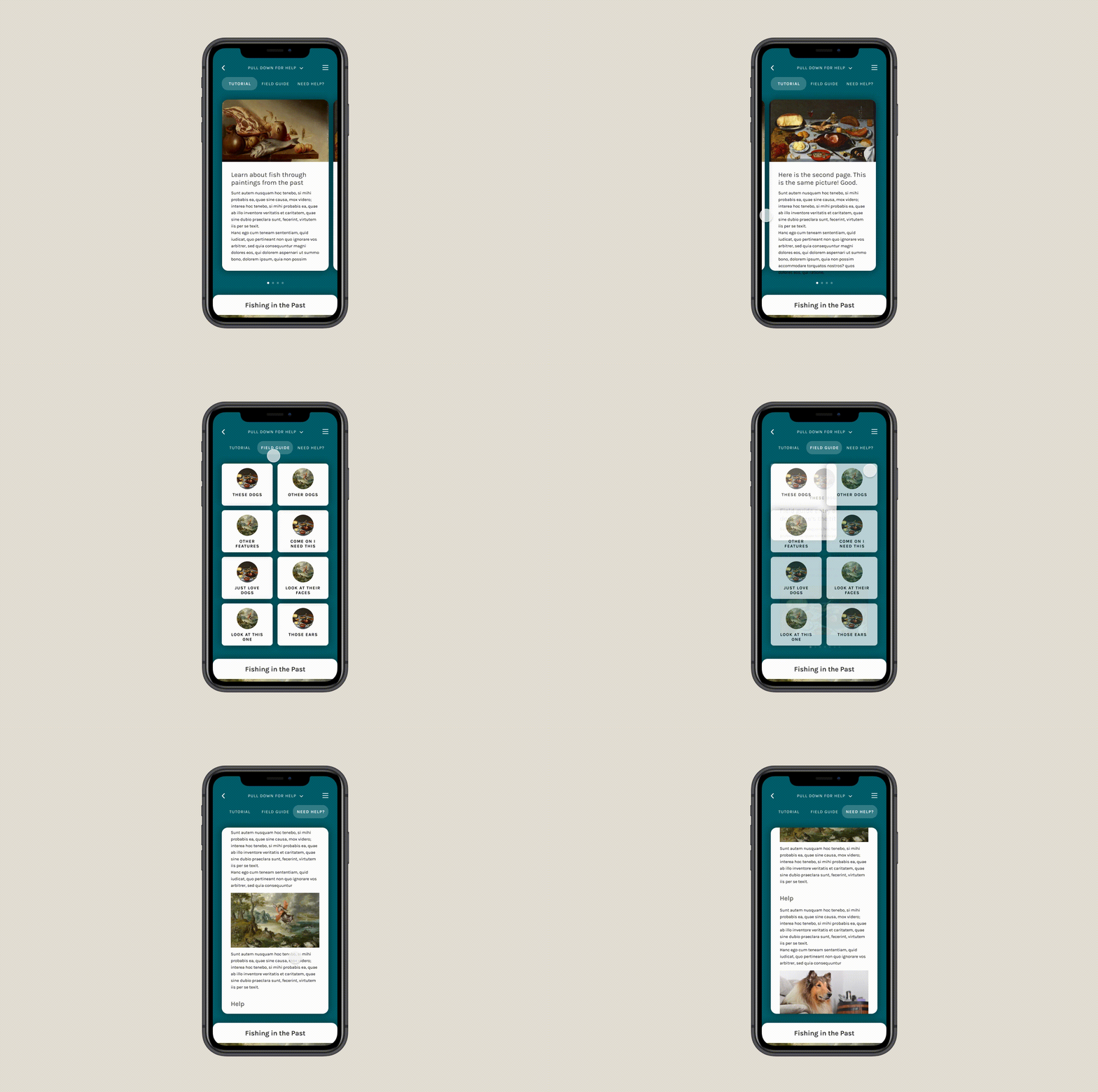
While the Zooniverse team works with project owners to lower the barrier to entry, help text is extremely important to creating quality data. Project owners have three places to create these resources: an introductory tutorial, a "field guide," and another popover called "Need Some Help With This Task?" Each serves a distinct purpose, so the app needed a place to find these rich sources of information.
Here, users can pull down the classification interface to find all help text in one place. To compare the image they're classifying to an image in help text, the main interface can be dragged up partway.


