
Rebranding Vokal
I was responsible for creating a new, more grown-up version of the Vokal brand. Starting with rethinking the logo and color palette, I took the brand’s identity from young tech startup to experienced mobile design agency.
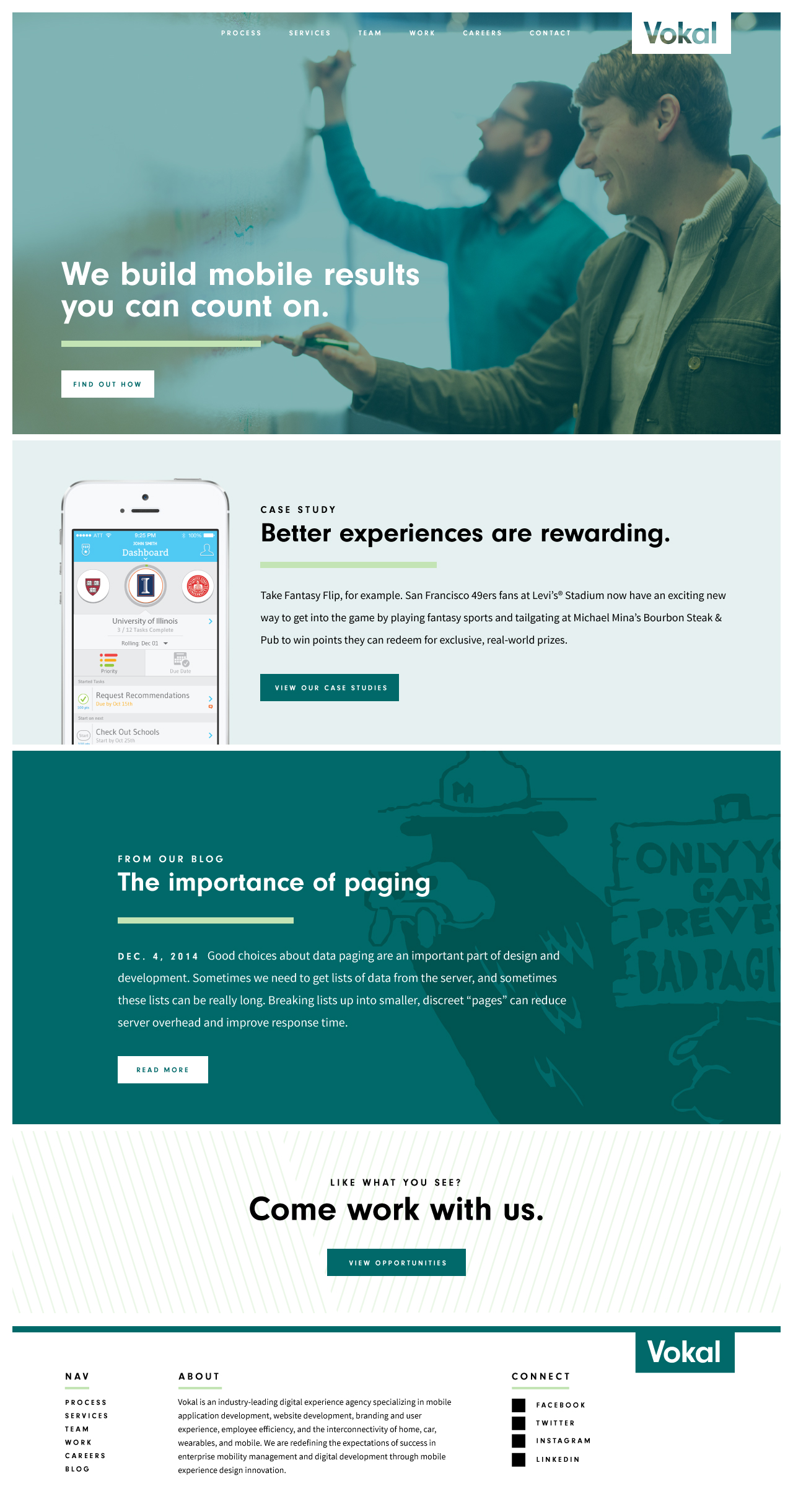
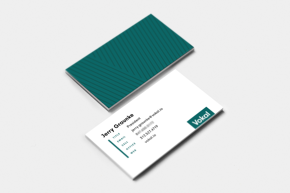
In addition to the logo, I also redesigned the website, art-directed photo shoots, worked with outside vendors to create print collateral such as letterpressed business cards and custom notebooks, and designed signage for the building’s exterior.
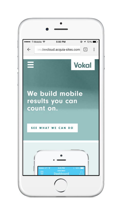
As a mobile-first experience design agency, Vokal’s website needed to be just as beautiful and usable on mobile devices as it is on larger screens. I worked with a developer to make sure content, photography, and usability remain front-and-center.


Project Category
Web Design
Mobile Design
Logos & Branding
—
Role
Visual Design
Creative Direction
Logo Exploration
Vokal’s original logo was enclosed in a circle, so initial exploration was centered around the evolution of that mark. Eventually we moved away from the circle mark to a simple, clean wordmark that we felt more perfectly encapsulated Vokal’s growth and market position.

